
As Orlando City wrap up their sixth overall season, now is as good a time as any to share this little project I’ve been working on. Just something I did out of curiosity mostly. I started thinking about all the players who have worn the purple (or red if it was 2011), and how all of them combined could tell the story of Orlando City’s rise through USL into MLS. I like maps, they allow you to view data in a different way. Think of it as spatializing a list to better understand how the data relates. Data in this case being the birthplaces of all the players who have played for Orlando City.
I chose Google’s Fusion Tables, I’m pretty comfortable with it and it is relatively straight forward to use. It is also free! One unfortunate limitation of the tool is its inability to just publish a workable map, so the attached link (below) will include the table and the map. Maybe it does publish and I just haven’t gotten there yet! This is all an experiment, so I’m very comfortable admitting this is all a learning experience.
I mapped 95 players from all of Orlando’s top tier teams, so USL 2011-2014 and MLS 2015-2016. Unfortunately USL has deleted their archives, so I had to rely on Wikipedia. I inherently don’t trust Wikipedia, but I went with what was available. I’ve included players under contract, but not trialists. A very few may of have never appeared for the club. I did my best to attach each player to a birth city. In one or two occurrences I was unable to find a player’s birth city so I used the nation’s capital. I have not, as of yet, attached a player to either the USL or MLS club (or both). I haven’t included Orlando City B yet either.
Here are some brief observations:
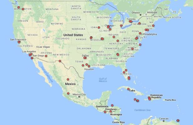
- Orlando City has had a nice representation of players from all over the United States along with the Caribbean and Central America. While this is expected, I did think more players would be from the South and Florida in particular. I suspect with the development of the youth system, this may increase over time.
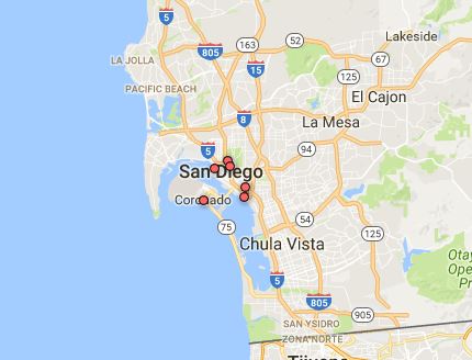
- The birthplace of the most Lions? San Diego with six. That came as a surprise to be honest. One quick research question comes to mind almost instantly, how many players in the history of MLS come from Southern California, does this follow a trend?
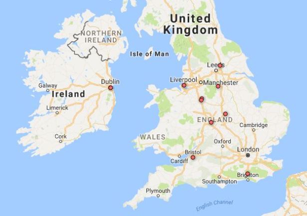
- Unsurprisingly, Orlando has had the most foreign players from the United Kingdom and Ireland. The club’s roots and relationship with Stoke City have obviously helped the club connect with players from this region. There were also a fair number of players from the Caribbean.
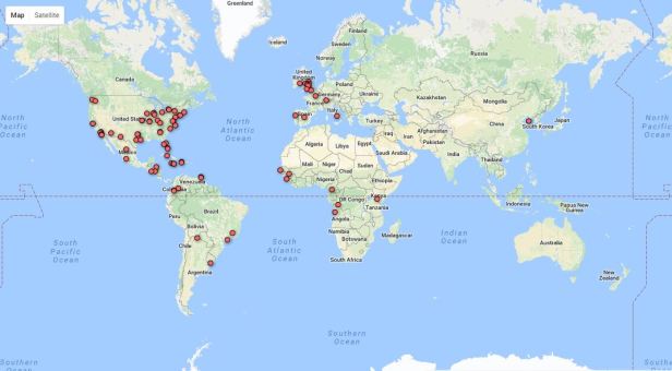
- Here’s a view of the whole world for some perspective. We see you over there Long Tan!
- And here is the link, it is more interactive and allows you to see who each of those dots actually represent. It will take you to the tables, look for the “Location Map” tab to see the above image: Orlando City Player Birthplaces
So here are some limitations, considerations, and conclusions:
- First, and maybe most important, what does this teach us? That’s a great question, right now only a little bit. I think maps are a great way to start understanding research. Eventually, as more players are added over time, larger trends (and outliers) will emerge.
- In terms of starting points, birthplaces can tell us only part of the story. In our modern society a birthplace can be as much a home as it is merely a place of origin. I’d love to work with another mapping tool to perhaps trace each player’s journey to the club over time. Imagine seeing players move from club to club until they reach Orlando, that would look amazing!
- If we think of USL and MLS as leagues that were built with the long term goal of building American talent (a contested claim I’m sure), this map can show the success rate of such a project.
- While the club had the most players from the UK and Ireland, this trend could change over time with an increased influence of Brazilian ownership and a star player. As time goes on, any number of influences both up front and behind the scenes (scouting network, for example) could add more players from other countries.
- I haven’t yet added Orlando City B players, something that I think could only another welcome layer complexity. I’d also like to return and update the map with each new season’s roster. Each year can only add more data points to draw more deductions from.
- Part of my desire to do this was to practice a bit before I worked with teams with longer histories and many more players. Orlando’s shorter relative history gives a pretty limited view. Imagine a team like the Seattle Sounders or the Portland Timbers with their long history in multiple American leagues, imagine an English club with hundreds of years of history. I think a map like that could tell an interesting story.
- Beyond the mapping aspect of Fusion Tables, there are also the “cards” which have the ability to add more statistics. I’d like to add more data there as well, games with each team in the club or goals might be interesting.
The next steps will be to add OCB players, update the MLS roster for both new and departing players, as well as develop some research questions based on any ideas this map sparks. So look for posts on that in the coming months I hope.
So that’s the starting point for this project. I look forward to seeing where this might go in a the future and what kind of feedback you have. I think it is limited right now, but the more players that get added can only add to the conclusions we can draw. Let me know what you think, or if you find any discrepancies with players, years, or birthplaces etc. Either comment below or shout at me on Twitter: @KevinIsHistory
